1"use client";
2
3import { useState, useRef, useEffect } from "react";
4import Logo from "./logo";
5import Cta, { BackendProvider } from "./cta";
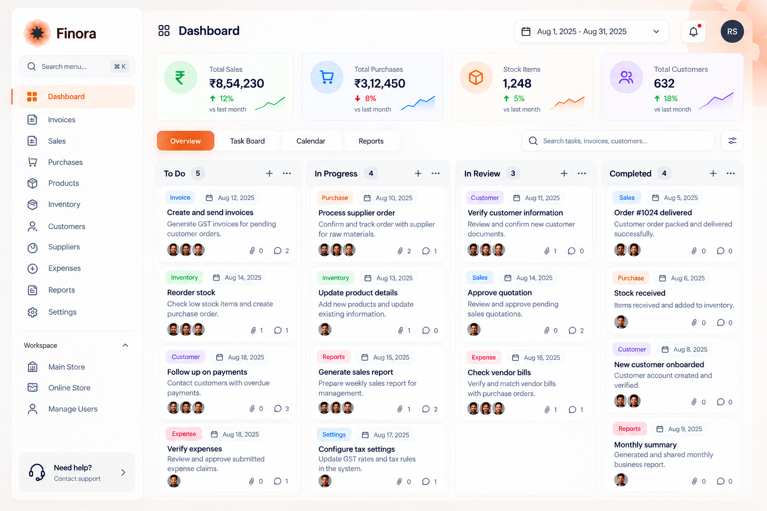
6import dash from "./dashboard.png";
7
8export interface Hero2Props {
9 brandName?: string;
10 navItems?: string[];
11 dropdownLabel?: string;
12 dropdownItems?: string[];
13 loginButtonText?: string;
14 onLogin?: () => void;
15 onNavItemClick?: (item: string) => void;
16 onDropdownItemClick?: (item: string) => void;
17 badgePrefix?: string;
18 providers?: BackendProvider[];
19 title?: React.ReactNode;
20 description?: string;
21 primaryCtaText?: string;
22 secondaryCtaText?: string;
23 onPrimaryCta?: () => void;
24 onSecondaryCta?: () => void;
25 dashboardImageSrc?: string;
26 dashboardImageAlt?: string;
27 className?: string;
28}
29
30const Hero2: React.FC<Hero2Props> = ({
31 brandName = "Finora",
32 navItems = ["Home", "About", "Services"],
33 dropdownLabel = "More",
34 dropdownItems = ["Analytics", "Reports", "Integrations"],
35 loginButtonText = "Login",
36 onLogin,
37 onNavItemClick,
38 onDropdownItemClick,
39 badgePrefix,
40 providers,
41 title,
42 description,
43 primaryCtaText,
44 secondaryCtaText,
45 onPrimaryCta,
46 onSecondaryCta,
47 dashboardImageSrc,
48 dashboardImageAlt = "Finora analytics dashboard interface preview",
49 className = "",
50}) => {
51 const [isMenuOpen, setIsMenuOpen] = useState(false);
52 const [isDropdownOpen, setIsDropdownOpen] = useState(false);
53 const dropdownRef = useRef<HTMLDivElement>(null);
54
55
56 useEffect(() => {
57 const handleClickOutside = (event: MouseEvent) => {
58 if (
59 dropdownRef.current &&
60 !dropdownRef.current.contains(event.target as Node)
61 ) {
62 setIsDropdownOpen(false);
63 }
64 };
65
66 const handleKeyDown = (event: KeyboardEvent) => {
67 if (event.key === "Escape") {
68 setIsDropdownOpen(false);
69 setIsMenuOpen(false);
70 }
71 };
72
73 if (isDropdownOpen) {
74 document.addEventListener("mousedown", handleClickOutside);
75 }
76 document.addEventListener("keydown", handleKeyDown);
77
78 return () => {
79 document.removeEventListener("mousedown", handleClickOutside);
80 document.removeEventListener("keydown", handleKeyDown);
81 };
82 }, [isDropdownOpen]);
83
84 return (
85 <main
86 className={`min-h-screen w-full bg-neutral-800 ${className}`}
87 style={{
88 backgroundImage:
89 "radial-gradient(circle, rgb(148 163 184 / 0.55) 1px, transparent 1px)",
90 backgroundSize: "24px 24px",
91 }}
92 >
93 <div className="flex min-h-screen w-full items-start justify-center bg-[linear-gradient(to_right,rgba(10,10,10,0.2)_0%,#262626_10%,#262626_50%,#262626_90%,rgba(10,10,10,0.2)_100%)]">
94 {}
95 <div className="flex min-h-screen w-full max-w-6xl flex-col items-center gap-12 p-3 sm:p-6">
96 <nav className="sticky top-2 z-20 flex h-fit w-full flex-wrap items-center justify-between rounded-4xl bg-neutral-700/90 backdrop-blur-md p-2 border border-neutral-600/50 shadow-lg">
97 <div className="flex items-center gap-2 hover:bg-neutral-600/80 rounded-2xl cursor-pointer px-2.5 py-1.5 transition-colors">
98 <Logo />
99 <span className="text-lg text-orange-50 font-medium tracking-tight">
100 {brandName}
101 </span>
102 </div>
103
104 <div className="hidden items-center gap-2 sm:flex">
105 {navItems.map((key) => (
106 <button
107 key={key}
108 type="button"
109 onClick={() => onNavItemClick?.(key)}
110 className="cursor-pointer rounded-lg px-3 py-1.5 text-sm text-neutral-200 transition-colors hover:bg-neutral-600 hover:text-white focus-visible:outline-none focus-visible:ring-2 focus-visible:ring-orange-500/50"
111 >
112 {key}
113 </button>
114 ))}
115 <div className="relative" ref={dropdownRef}>
116 <button
117 type="button"
118 aria-expanded={isDropdownOpen}
119 aria-haspopup="true"
120 onClick={() => setIsDropdownOpen((open) => !open)}
121 className="flex cursor-pointer items-center gap-1.5 rounded-lg px-3 py-1.5 text-sm text-neutral-200 transition-colors hover:bg-neutral-600 hover:text-white focus-visible:outline-none focus-visible:ring-2 focus-visible:ring-orange-500/50"
122 >
123 <span>{dropdownLabel}</span>
124 <svg
125 aria-hidden="true"
126 className={`size-4 transition-transform duration-200 ${
127 isDropdownOpen ? "rotate-180" : ""
128 }`}
129 fill="none"
130 viewBox="0 0 24 24"
131 stroke="currentColor"
132 strokeWidth="2"
133 >
134 <path
135 strokeLinecap="round"
136 strokeLinejoin="round"
137 d="m6 9 6 6 6-6"
138 />
139 </svg>
140 </button>
141 <div
142 className={`absolute left-1/2 top-full z-10 mt-2 min-w-44 -translate-x-1/2 origin-top rounded-2xl border border-neutral-600 bg-neutral-700/95 backdrop-blur-md p-1.5 shadow-2xl transition-all duration-200 ${
143 isDropdownOpen
144 ? "scale-100 opacity-100"
145 : "pointer-events-none scale-95 opacity-0"
146 }`}
147 >
148 {dropdownItems.map((item) => (
149 <button
150 key={item}
151 type="button"
152 onClick={() => {
153 onDropdownItemClick?.(item);
154 setIsDropdownOpen(false);
155 }}
156 className="block w-full cursor-pointer rounded-xl px-3.5 py-2 text-left text-sm text-neutral-200 transition-colors hover:bg-neutral-600 hover:text-white focus-visible:outline-none focus-visible:bg-neutral-600"
157 >
158 {item}
159 </button>
160 ))}
161 </div>
162 </div>
163 </div>
164
165 <div className="hidden items-center gap-2 sm:flex">
166 <button
167 type="button"
168 onClick={onLogin}
169 className="cursor-pointer rounded-xl bg-orange-600 px-4 py-1.5 text-sm font-medium text-white shadow-sm transition-all duration-150 hover:bg-orange-700 active:scale-95 focus-visible:outline-none focus-visible:ring-2 focus-visible:ring-orange-500"
170 >
171 {loginButtonText}
172 </button>
173 </div>
174
175 <button
176 type="button"
177 aria-label={
178 isMenuOpen ? "Close navigation menu" : "Open navigation menu"
179 }
180 aria-expanded={isMenuOpen}
181 onClick={() => setIsMenuOpen((open) => !open)}
182 className="group flex size-10 cursor-pointer flex-col items-center justify-center gap-1.5 rounded-full transition-colors hover:bg-neutral-600 sm:hidden focus-visible:outline-none focus-visible:ring-2 focus-visible:ring-orange-500"
183 >
184 <svg
185 aria-hidden="true"
186 className="size-5 text-neutral-200"
187 fill="none"
188 viewBox="0 0 24 24"
189 stroke="currentColor"
190 strokeWidth="2"
191 >
192 <path
193 className={`origin-center transition-transform duration-300 ${
194 isMenuOpen ? "translate-y-1 rotate-45" : ""
195 }`}
196 strokeLinecap="round"
197 d="M4 8h16"
198 />
199 <path
200 className={`origin-center transition-transform duration-300 ${
201 isMenuOpen ? "-translate-y-1 -rotate-45" : ""
202 }`}
203 strokeLinecap="round"
204 d="M4 16h16"
205 />
206 </svg>
207 </button>
208
209 <div
210 className={`basis-full overflow-hidden transition-all duration-300 ease-out sm:hidden ${
211 isMenuOpen
212 ? "mt-2 max-h-96 opacity-100"
213 : "pointer-events-none max-h-0 opacity-0"
214 }`}
215 >
216 <div className="flex flex-col gap-1 border-t border-neutral-600 pt-2">
217 {navItems.map((key, index) => (
218 <button
219 key={key}
220 type="button"
221 onClick={() => {
222 onNavItemClick?.(key);
223 setIsMenuOpen(false);
224 }}
225 className={`rounded-md p-2 text-left text-sm text-neutral-200 transition-all duration-300 hover:bg-neutral-600 ${
226 isMenuOpen
227 ? "translate-x-0 opacity-100"
228 : "-translate-x-2 opacity-0"
229 }`}
230 style={{ transitionDelay: `${index * 50}ms` }}
231 >
232 {key}
233 </button>
234 ))}
235 <div
236 className={`overflow-hidden transition-all duration-300 ${
237 isDropdownOpen ? "max-h-48" : "max-h-10"
238 }`}
239 >
240 <button
241 type="button"
242 aria-expanded={isDropdownOpen}
243 onClick={() => setIsDropdownOpen((open) => !open)}
244 className={`flex w-full items-center justify-between rounded-md p-2 text-left text-sm text-neutral-200 transition-all duration-300 hover:bg-neutral-600 ${
245 isMenuOpen
246 ? "translate-x-0 opacity-100"
247 : "-translate-x-2 opacity-0"
248 }`}
249 style={{ transitionDelay: `${navItems.length * 50}ms` }}
250 >
251 <span>{dropdownLabel}</span>
252 <svg
253 aria-hidden="true"
254 className={`size-4 transition-transform duration-200 ${
255 isDropdownOpen ? "rotate-180" : ""
256 }`}
257 fill="none"
258 viewBox="0 0 24 24"
259 stroke="currentColor"
260 strokeWidth="2"
261 >
262 <path
263 strokeLinecap="round"
264 strokeLinejoin="round"
265 d="m6 9 6 6 6-6"
266 />
267 </svg>
268 </button>
269 <div className="ml-3 flex flex-col border-l border-neutral-600 pl-2">
270 {dropdownItems.map((item, index) => (
271 <button
272 key={item}
273 type="button"
274 onClick={() => {
275 onDropdownItemClick?.(item);
276 setIsDropdownOpen(false);
277 setIsMenuOpen(false);
278 }}
279 className={`rounded-md px-2 py-1.5 text-left text-sm text-neutral-300 transition-all duration-200 hover:bg-neutral-600 hover:text-white ${
280 isDropdownOpen
281 ? "translate-x-0 opacity-100"
282 : "-translate-x-2 opacity-0"
283 }`}
284 style={{
285 transitionDelay: `${(navItems.length + index + 1) * 50}ms`,
286 }}
287 >
288 {item}
289 </button>
290 ))}
291 </div>
292 </div>
293 <button
294 type="button"
295 onClick={() => {
296 onLogin?.();
297 setIsMenuOpen(false);
298 }}
299 className={`mt-1 rounded-md bg-orange-600 p-2 text-left text-sm font-medium text-white transition-all duration-300 hover:bg-orange-700 ${
300 isMenuOpen
301 ? "translate-x-0 opacity-100"
302 : "-translate-x-2 opacity-0"
303 }`}
304 style={{ transitionDelay: `${navItems.length * 50}ms` }}
305 >
306 {loginButtonText}
307 </button>
308 </div>
309 </div>
310 </nav>
311
312 <Cta
313 badgePrefix={badgePrefix}
314 providers={providers}
315 title={title}
316 description={description}
317 primaryCtaText={primaryCtaText}
318 secondaryCtaText={secondaryCtaText}
319 onPrimaryCta={onPrimaryCta}
320 onSecondaryCta={onSecondaryCta}
321 />
322
323 <div className="min-h-96 w-full flex-1 rounded-2xl bg-neutral-900/80 border border-neutral-700/60 shadow-2xl p-3 sm:p-5 flex items-center justify-center overflow-hidden">
324 <img
325 src={dashboardImageSrc || dash.src}
326 className="rounded-xl object-cover w-full shadow-inner border border-neutral-800"
327 alt={dashboardImageAlt}
328 />
329 </div>
330 </div>
331 </div>
332 </main>
333 );
334};
335
336export default Hero2;